
TYPEFACE DESIGNRuzafa
An eye-catching sans-serif typeface derived from the bustling city of Valencia, Spain.
BRIEF
Research and document existing lettering, then design and create a bespoke typeface inspired by your findings.
ABOUT
The Ruzafa typeface is inspired by the distinctive lettering found on the exterior of Mercat de Russafa, a bustling food market in Valencia, Spain, since its opening in 1962. Located in the heart of the Ruzafa neighborhood, the market is a vital part of local life, and its letterforms exude a unique character.
Drawing from Brutalist architecture and geometric design, the typeface captures the energy and personality of the original letters. Each character reflects a different aspect of this dynamic style. The Ruzafa typeface is a versatile sans-serif, ideal for bold display uses and impactful headings.
PROJECT TYPE
Typography Design
ROLE
Typography Designer
SOFTWARE
Adobe Illustrator, Adobe Indesign, Adobe Photoshop
DELIVERABLES
Typeface Specimen
MADE FOR EDUCATIONAL PURPOSES


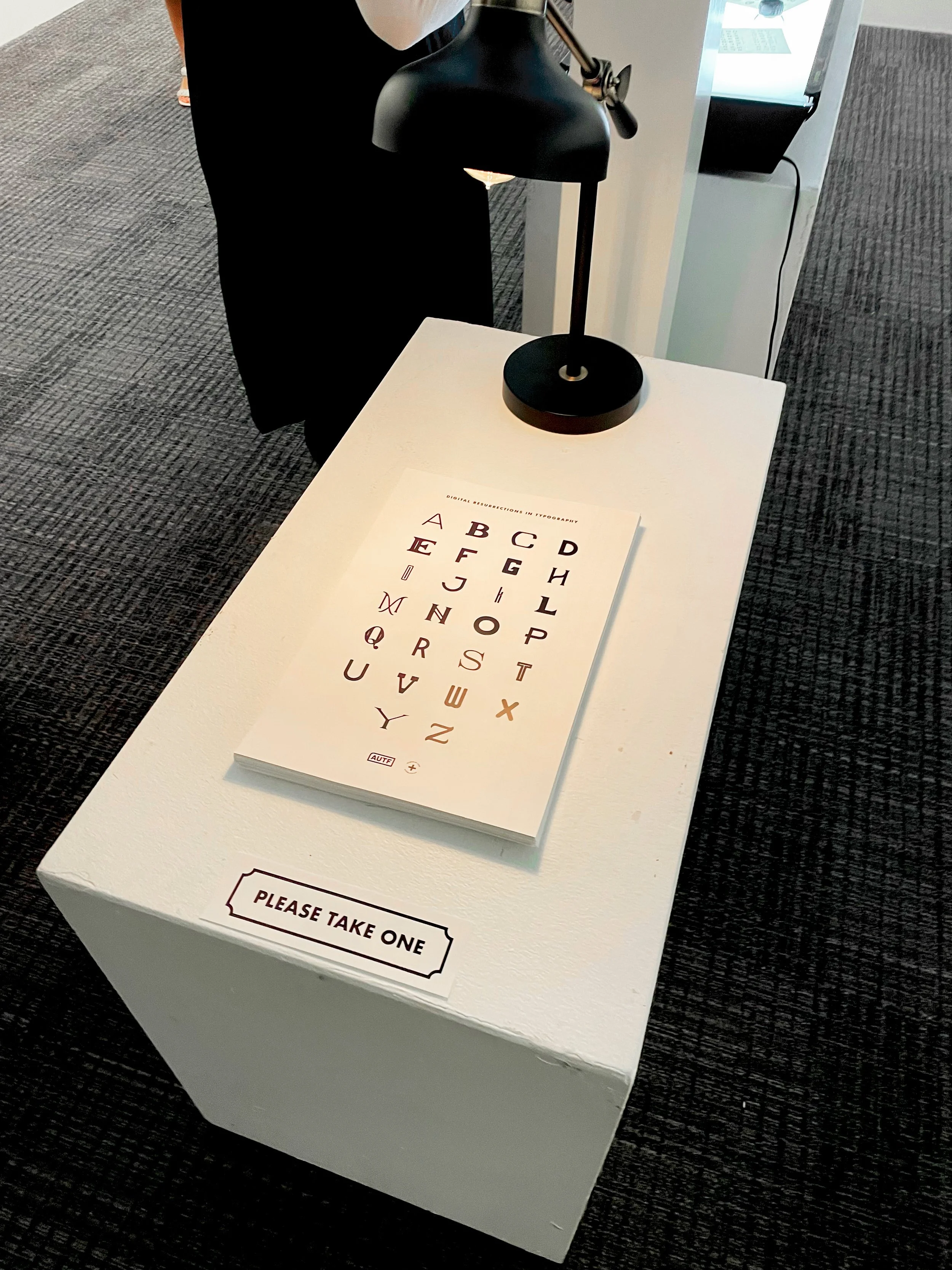
TYPOGRAPHY EXHIBITIONThe Archive
Letters Lost, Type Found
After each designer completed their custom typeface, it was time to bring them to life and make them accessible to the public. With the typefaces on display at the exhibition, visitors were able to experience the characters in a tangible and interactive way, transforming the designs from static concepts into living, breathing works of art. The exhibition was a vibrant showcase of creativity, as each typeface not only represented the personal design journey of each creator but also became part of a shared visual experience for the audience.
I was assigned to the Book Team, where we had the exciting responsibility of curating and creating a series of books. These books were not only for the students who had worked on the typefaces but also for those who attended the exhibition, allowing them to delve deeper into the design process behind each typeface. Our goal was to design books that would capture the essence of the exhibition—both as a celebration of typography and as a reflection of the individual stories behind each design. We carefully selected the content, layout, and presentation to ensure that each book told the story of the typefaces in an engaging, informative, and visually appealing way.
PROJECT TYPE
Typography Exhibition, Experience Design
ROLE
Special Book Team, Printer, Spread Designer
SOFTWARE
Adobe Illustrator, Adobe Indesign, Adobe Photoshop
DELIVERABLES
Special Book, Show Book, Exhibition, Type Posters,
Branding, Merchandise
COLLABORATION
Classmates, Publication Team
MADE FOR EDUCATIONAL PURPOSES


OUTCOME + TAKEAWAY
Designing a typeface based on unique lettering presented its own set of challenges. The key was maintaining the essence of the original letterforms while ensuring those characteristics were consistently applied across the entire typeface. Each classmate’s typeface was distinct. It was truly inspiring to witness the transformation of individual letters, once seen on a building, into a complete, functional typeface. It felt like a moment of historical significance to have the opportunity to digitize these simple letterforms, preserving their character and bringing them into the modern design world.